How misleading statistics are used by the media to influence the public 👹

Statistics is power. The media knows that. Politicians know that. Advertisers know that.
Stats can be misleading even when they are true and factual.
There is no shortage of cases where statistics have been used to polarize the public view in a particular direction.
The purpose of this article is to raise awareness on how statistics can be used to mislead or persuade.
Let's begin.
-
1. Bad Sampling
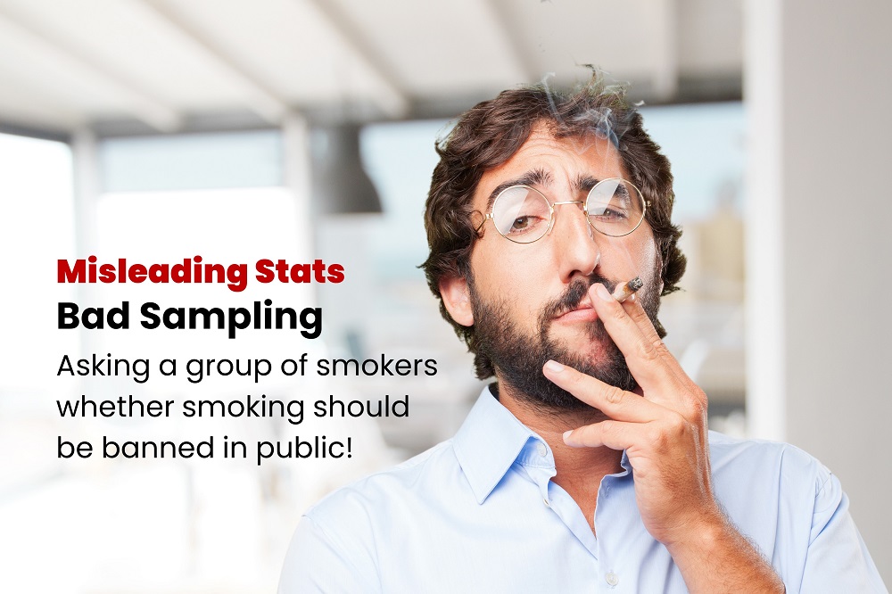
This happens when the survey is conducted on a sample that is not random or diverse enough.
Example: asking a group of mostly smokers whether smoking in public places should be banned.
A survey that is not random enough cannot be trusted.
-
2. Using the average exclusively

The average is just one of the many statistical indicators. Using it exclusively can lead to incorrect conclusions.
It is important to look into other factors (like frequency for example) to get the complete picture.
The example above is humourous but similar statements are being used in everyday campaigns to mislead the public.
-
3. Small Sample Size
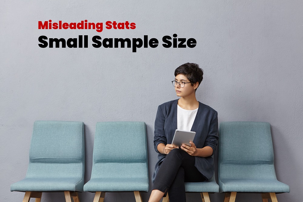
Even when the sample is random enough, you still need a considerable number of participants to draw any reasonable conclusions.
For example, asking 20 random people out of a 100 million population about a nationwide issue.
-
4. Misleading Graphs

See the graph above? Do you notice anything suspicious?
Reading into the graph, one would get the impression that road accidents in the UK are almost double than those in France, but if you examine closely you will notice that the graph does not start at zero, but at 100,000.
The actual difference is only 5%.
-
5. Wrong Period
Example: asking people whether prices have increased during a price reduction period.
Whenever you hear of any survey, ask the important question: "When was this survey conducted?"
-
6. Unproportionous Scales
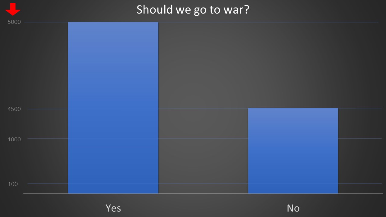
In the graph above, it looks as if the number of people opposing military action is half the percentage of those with it, when in fact the difference is just 10%.
This is due to the uneven positions of the ticks on the y-axis. When the gaps are not in proportion, the graph looks skewed.
-
7. Different Prespective
Read the below two statements:
Statement A: 80% of the population have jobs.
Statement B: 20% of the population don't have jobs.
A pro-government agency will advertise and boost Statement A to show that things are fine.
An anti-government agency will promote Statement B to show that life is difficult and change is needed.
Both statements are correct but it all depends on the context and the way the facts are portraited and used.
-
8. Specifically Crafted Questions
Surveys may be designed in a way that steers answers in a desired direction.
Consider the below two survey questions about abortion.
Question A:
Do you think that mothers have the right to choose whether to keep a child or not?
Question B:
Do you think that mothers have the right to KILL their unborn babies?
These questions have been asked in two groups of random people. What do you think the results were?
Group A results were 58% for Yes and 42% for No.
Group B results were 46% for Yes and 54% for No.
Clearly asking the right or wrong question can tip the survey results in any direction.
-
9. Misleading correlations.
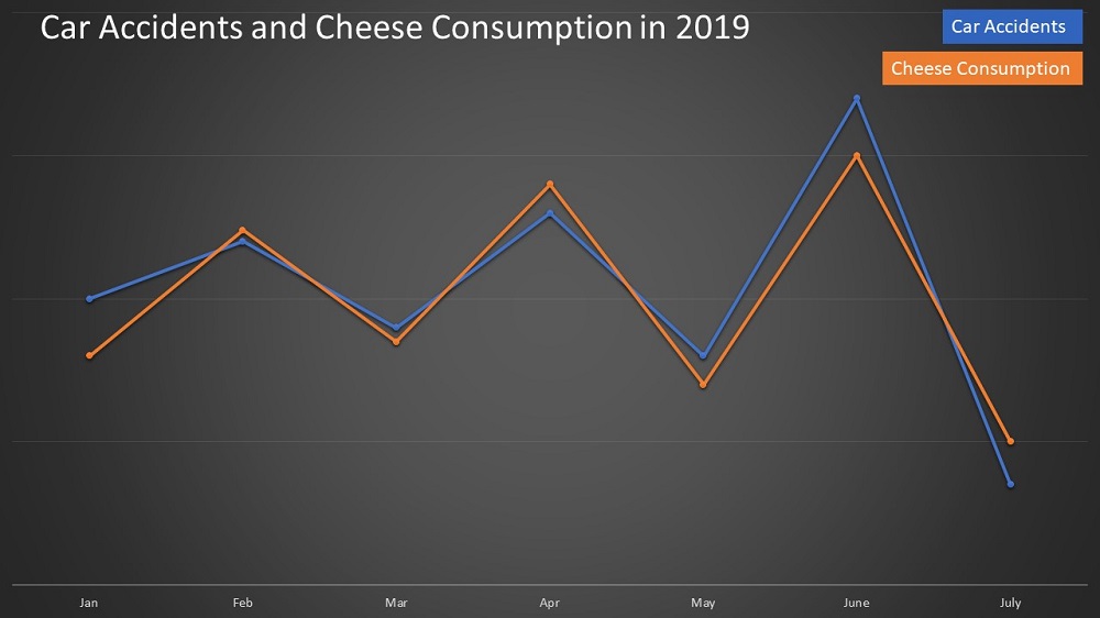
Reading into the graph above, you will notice that cheese consumption and car accidents are somehow correlated.
Based on this information we can deduce the following
Higher cheese consumption leads to more car accidents!
Or
The increase in car accidents leads to higher cheese consumption!
Ok, this makes no sense at all but I had to show you an extreme example so you get the idea quickly.
Correlations are used in the media to influence people into thinking that one factor is causing another, which is not always true.
When two things are correlated it could mean one of four things:
A causes B
B causes A
A and B are both caused by C
A and B are not related and their correlation is just a coincidence.
-
10. Simpon's Paradox

Simpson's paradox happens when two or more samples are grouped in a certain way to draw a specific conclusion.
The reason why the paradox happens is that the group sizes are not equal in both samples.
In this particular example, the number of males and females in the groups is not the same.
-
11. The percent dilemma
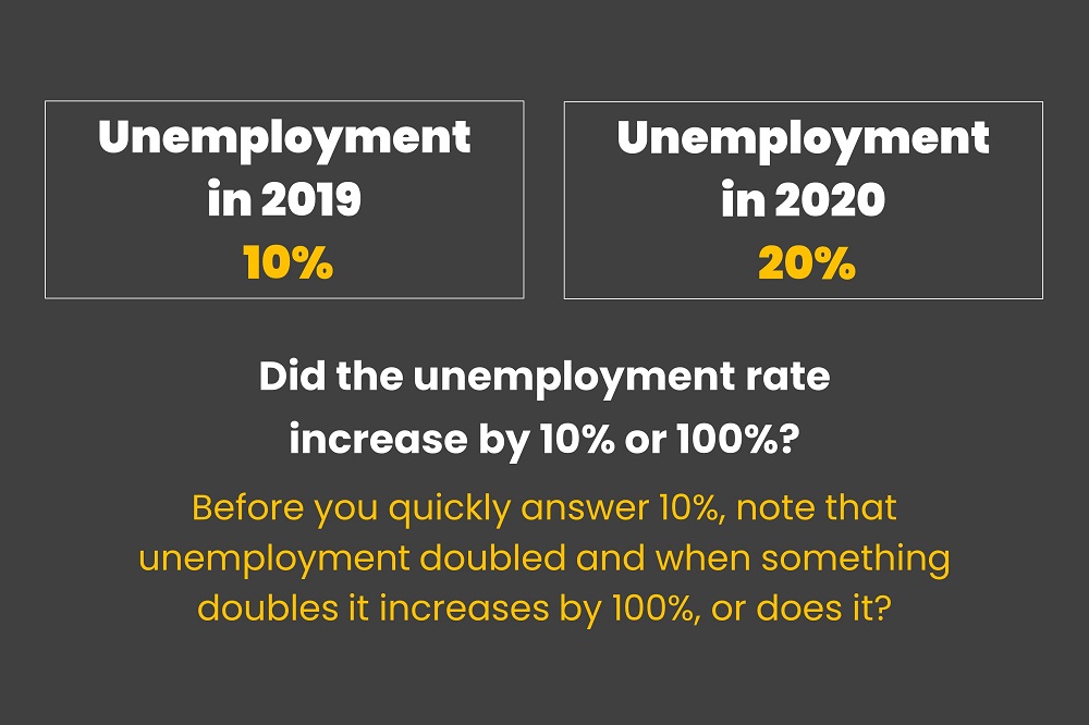
Which statement is correct?
Both are correct, it depends on what you are comparing with.
When you are dealing with percent changes it is important to know the base at which the comparison was made to.
-
12. Ignoring History
The following news showed up on a government news agency:
"Fuel prices have decreased by 10% in 2021!"
This is obviously good news only that they failed to mention that fuel prices have increased by 80% from 2019 to 2020.
So basically we are still up by 70% from 2019.
Always backtrack enough into history to get the bigger picture.
-
13. Mixed Logic

Consider the following statement.
40% of car accidents are caused by white cars, which means that if you drive a white car there is a 40% chance of you causing a car accident!
That is just plain wrong of course.
Sadly, such mistakes happen all the time when interpreting survey results.
The probability of A given B is not the same as B given A.
-
14. Zoomed-in Graphs
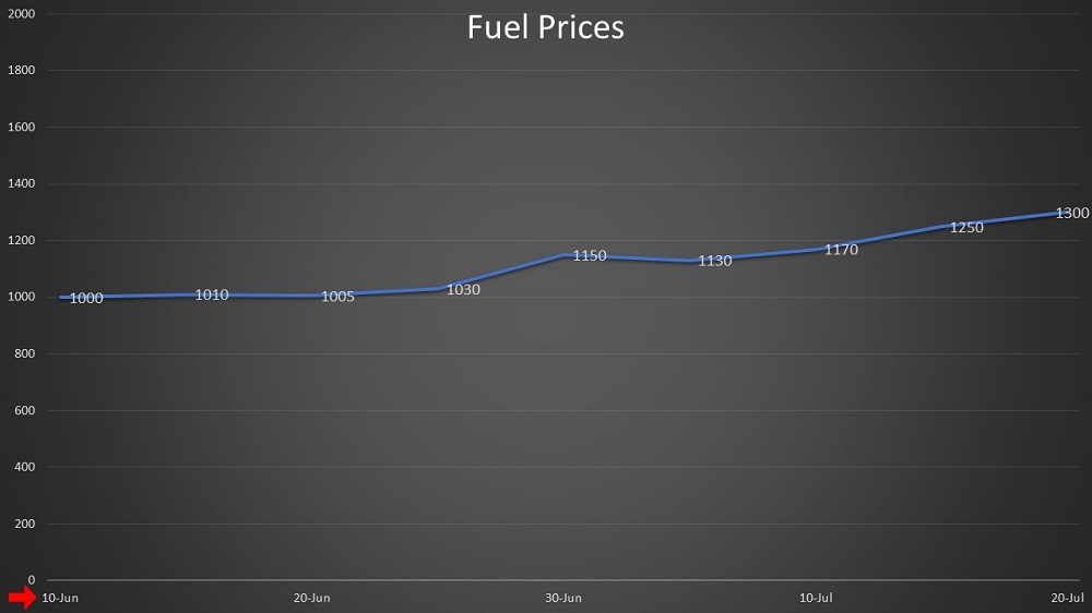
See the graph above which shows the fuel price over a period of time.
Notice how the time period is very short. It only covers 50 days.
The creator of the graph had a specific intent of showing a surge in prices, so he zoomed in into a specific period.
The original graph is displayed below and clearly shows that there is not really that much difference from the usual trend.

-
15. Exaggerated Scales

Looking at the graph above, it really doesn't seem that fuel prices are increasing much.
Actually, there has been a significant increase from the normal price but the graph does not show it because the range of values on the Y-axis has been unnecessarily exaggerated.
The maximum value is 10000 while all the figures on the graph don't exceed 1300!
The original graph is displayed below.

As you can see, fuel prices in December have surged beyond the normal average.
 Close
Close


